Tuesday 28 April 2009

Profile Picture With a Smile


Now when you see the image above, I know you will laugh and I am laughing with you. While I did this, my intention was to have fun. This all started when I noticed my profile picture was non-existent and I have had a blog for nearly six months now. I felt this was an opportunity to have some fun and making something different. The Brady Bunch style image was something I have been thinking of doing for some time and this always made me laugh. As people laugh, it’s the reaction I want. I feel it’s good to see something what makes you smile than nothing at all.

One Day Brief - Christmas Greetings


As the end of the second year gets closer, another one day brief was challenged. The task was to design three concepts for a Christmas greeting for a list of design agencies given. This was to be done in pairs, which were chosen at random. I had the pleasure of working with Michelle McKee and having a one to one basis throughout the day was much fun. Our decision was to choose design agency True North. Our first two ideas involved messing with the logo making the letter T look like a Christmas tree printed on a card and the other was to have a greetings message on a party popper. We felt the ideas were strong but both agreed the final idea was the best. We came up with an idea of sending out fridge magnets with seasonal words like Turkey, Santa Clause, Presents and other related words to that time of year for you to then make up your very own message. Obviously, we had happy Christmas from True North in the greeting to. I very much enjoyed the brief and look forward to similar ones in the future.

Simon Oliver


This past week, I was looking on the Internet for some local graphic agencies for a possible review regarding my portfolio. I was desperate for a professional’s opinion on the layout, structure, presentation and type setting. I was lucky to find a designer in London called Simon Oliver who had a professional out website. His work was at a high standard so I decided to e-mail him for a possible look at my work. Simon responded fairly quickly advising me to get better images of the Tea, Ping-Pong and magazine work digitally better. He also advised to maybe get my work on the Internet for a broader audience. I replied by telling him my blog address and if he may would want to look at that. Again, Simon replied with some useful advice. He said I should cut down the text, which explains the process of my work. From this, I plan to have my own website in the near future.

Sunday 26 April 2009

My Book Collection - Three New Books


I recently purchased three books to my growing collection. I have been keeping a close eye on Magma’s shelves and there new stock for a number of weeks and I finally decided to make the following purchases. They were Life’s a Pitch, Guerrilla Advertising and How To Be a Graphic Designer, Without Losing Your Soul. All three have some good stuff to reference from. Life’s a Pitch is about how to make the best approach in making a presentation to clients. It also touches on job interviews, meetings and how to be noticed in the design world. Guerrilla Advertising has examples of clever use in unconventional brand communication. Very similar to Advertising is Dead, Long Live Advertising, it has shows clever examples of the use of outdoor objects as a selling point. How To Be a Graphic Designer Without Losing Your Soul is definitely the most useful book out of all three as it covers most issues within the industry. From graduating looking for your first job, to setting up your very own studio.

Saturday 25 April 2009

Toxel.com - Gillette Advertising Campaign


As I was browsing through Toxel.com (yet again), I come across an advertising campaign involving an ice resurface machine and a Gillette Fusion Power Razor. The idea for this ad I feel is fantastic and combines two subjects into a selling point perfectly. The idea of making the resurface machine seem as though the razors are giving the ice a smoother shave works well.

Friday 24 April 2009

Craig Oldham


This past week, a fairly new graphic designer called Craig Oldham came along for a talk. This was a different talk from most which I had attended in the past as Craig had only graduated from university three years ago so his understanding on being a student was fairly fresh in his mind. He previously worked for the Chase and now works for Music where I made a portfolio visit not to long ago. As we sat down, a fifteen page newspaper, designed by Craig, was for us to read through. It was called the 12 in 12. It supported his talk, which involved the issues you should be aware of when leaving university. He talked about staying up all night trying to meet deadlines while being a student. He seemed very passionate about his work and design.

He first explained the two different types of designers in the industry. One would be logical and the other would fall in an emotional category. I felt this was important as he suggested this would help us think whom we would want to work for. He advised honesty is the best in the industry. He explained he couldn’t do web design at all and by saying this to people, it gave him the opportunity to learn more in that field. He also talked about portfolios and how everyone looks differently at it. No matter how many people you show, all opinions will not be the same. People will always say your work is poor or in Craig’s words ‘’Shit’’.

He talked about placements and the rewards you get out of them. Meeting new people, looking good on your CV, helping you be more confident and putting you ahead of the competition all fall into visiting studios and helping out.
Exploiting every possible chance of contacts is a must. Craig’s contact list was amazingly big considering the length of time he has been a designer. He also touched on mistakes and how you should learn from them, design being 20% of your actual job, be honest with everyone and being emotional about your work should not be hidden. Overall, the talk was fantastic and Craig definitely made some good points to look out for when graduating.

Wednesday 22 April 2009

One Day Brief - Species and Spaces


As the first day back from the Easter arrived, a brief was set to be completed for 4pm that day. The brief was to record through writing a chosen environment of the everyday actions throughout the area. I was given the train station, which I was looking forward to writing about. The mad rush in that environment of passengers with one goal getting there destination. The brief did not require academic writing, but more of a recording. My visit was interesting to say the least. I very much enjoyed the brief.

Music


Over the Easter holidays, I was lucky to arrange a portfolio visit with graphic design agency Music. One of Music’s head designers, Anthony Smith had recently held a lecture, which I was lucky to attend. After the talk, I managed to have a brief chat with Anthony and get to know him on a personal level very slightly so contacting him after this was easy. Around the start of April, I emailed Music asking for some images supporting my post for the blog and also inquiring the possibilities of a portfolio visit in the near future. Anthony replied very quickly, not just with the images I asked for, but agreeing a visit. I replied thanking him for the images and explained my free time for the next two weeks.

My visit had recently passed and I found it most useful. I had spoken to some classmates who had previously visited the studio the past week so getting to the location was easy. As I walked down Oldham Rd, I made my turn to the studio. The surroundings didn’t look like a place for a graphic studio but after locating the site on Google map, I new I was at the right place. As I pressed the buzzer and explained my presence, I was sent up. As I waked up the stairs, a number of last minute thoughts were going through my mind. What questions to ask, what if Anthony doesn’t like my work and how do I put myself across the right way.

I walked through the door to be introduced by Matt, one of the founders of Music. Anthony then appeared asking how I was finding the studio. I suddenly felt very comfortable and sat down patiently waiting for my talk with Anthony to start (I was slightly early). He asked if I wanted anything to eat or drink and we began to have a general talk about the industry and my work. Anthony started to look through my portfolio at quite a slow pace asking questions on why, what and how I did my designs. He also commented on the use of a small book I had as containing my work. I asked what he thought would be best regarding the presentation of a portfolio. He explained a useful layout stating the brief and solution with the work is always a good technique to use as it helps the person understand the concept of the work.

From there, Anthony began to ask me some questions regarding my future plans in the industry and what type of design studio I would want to work for. I had never really thought about this until now in all honesty. I said working for an agency with freedom of design would be a preferred choice as you then would not be restricted with the rules of what the client sets. He then advised me to design a portfolio targeting that area of design.

Overall, the visit lasted for around an hour. The studio was at a reasonable size and all the people were very friendly. I felt very grateful for Anthony’s time and the use of questioning his knowledge of the graphic industry was so rewarding. As the talk became to a finish, Anthony asked me to stay in touch and if had any work he wanted me to look over, I should send it him via e – mail. I thanked him and the rest of the team and left. I felt great and motivated after the talk and the use of seeing a studio and a designer on a one to one basis is greatly useful.

Friday 17 April 2009

D&AD


Over the past two years, I have attended some lectures from D&AD. As an educational charity, they represent the global creative, design and advertising communities.  They hold awards, similar to the YCN, which I have entered this year. D&AD describe the awards as ‘’The biggest and the best, rewarding outstanding creativity, mould-breaking thinking and the highest standard of design and innovation’’. The award is called a pencil and having one of these definitely makes you stand out from the rest of the crowed. The beauty about D&AD is their frame of mind is not to make any profit what so ever. They invest around £2 million in 18 different education programmes helping college and universities. They describe themselves as the ‘’Bridge’’ in between education and the work place. 

While in Liverpool for the Biennial, D&AD held a presentation with some of the year’s candidates. This was definitely a huge boost for us all as being in Liverpool at the time, we also had the chance for this great lecture. We were explained how the work entered is judged and how the relationship between candidate agency’s can bring up politic issues.

Liverpool Biennial


Around November, as a group, our tutors James and Ian arranged a trip to the Liverpool Biennial. Liverpool Biennial is one of the most important public art agencies in the North West. They held exhibitions in twenty eight different locations around Liverpool and the name of the event was called Made Up.. The visit was very inspiring. Our first location was the Tate gallery on the docks. Graphic design agency Thoughtful interacted within the project and we were lucky enough for a tour guide by them. We were first shown the Tate’s section of the Biennial. Thoughtful was commissioned to produce the identity of the exhibition for the Tate and when explaining the process of their ideas and designs, you could notice they were very passionate about the project. From there, we were shown three to four more venues plus some of the landmarks in the city. As a group, we were then handed a map to tour the city of Liverpool for the rest of the locations. I mostly found locating the rest of the Biennial sites enjoyable. The different areas in Liverpool I was lucky to tour around was fantastic. This was a great opportunity to see the city in very good detail. Liverpool is definitely an area for contemporary art.

Being in Liverpool was also an opportunity to see a presentation called The Emotional Type held by the Design Symposium. This was a great event to attend, as the work on show was great to see. Bruno Magg (the director of Dalton Maag located in London and Zurich) presented it. The lecture varied from layouts to typography and the use of design being very important. The work was very inspiring.

Tuesday 14 April 2009

Invitation Design


I was recently asked to make some birthday and wedding invitations for some friends. I have never really looked into the design aspect of invitations so I decided to look up some examples to get me started. I came across a blog by AG Design and they had a number of posts displaying some interesting results. Above are a number of invites that have inspired me.

Monday 13 April 2009

Rita


As the YCN brief has passed, I am looking forward to the feedback in June/July. Recently I came across a similar idea to my own involving a dot-to-dot sequence which joins up to show a message. In this case, it’s a logo for a piece of stationary. I was pleasantly surprised to see this as besides the idea working well, I felt it was good to see it as a real concept. The work is from a female designer called Rita. Her methods of design involve using objects and graphics together.

Thursday 9 April 2009

David Airey - Graphic Design


Around a year ago, while looking for some research on freelance and independent graphic designers, I was lucky to find a website by David Airey. David is a graphic designer from Northern Ireland and ever since I came across his website, I have followed it on a regular basis. His work covers all aspects of design from logo to websites. I feel its rewarding to find work unexpectedly. I very much like the logo work David has done and I plan to carry on following his designs in the future.

Street Art In Manchester


As I was walking through Manchester Town centre, I noticed a crowed of people surrounding a piece of walk path. As I looked closer, a man was kneeled down painting some interesting illustrations. This instantly reminded me of the work from Edgar Mueller, a world-famous pavement artist. I have seen some clever and interesting paintings similar to the images above on the internet but I have never had the pleasure to witness them being painted in front of my very own eyes. It was remarkable to witness as the fine detail and time the artist took was fantastic. I found the piece of information above the paintings clever to promote yourself as an up and coming fine artist. ''Working towards my exhibition. Your coins help me buy paints and canvas......thank you''. It was a shame as when i asked for the arists name, he quietly carried on with his work with no answer.

Working With A Concept


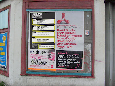
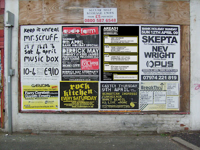
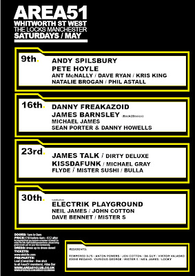
Recently, I have been learning how to put my designs in a concept so my ideas can look as realistic as possible. As I was walking past an old building in Manchester, I noticed a plank on wood with a number of nightclub posters displayed. I decided to take a quick picture of it, apply a quick design, and skew it in Photoshop. Here, I have applied a poster (designed quickly) to two different walls for full effect.

Wednesday 8 April 2009

A to M Agency Contact


I received an e-mail from Manchester based graphic design company A to M recently. Some time ago, I emailed A to M asking for some general advice and i was happy to find a response from Mike, one of their designers. He advised getting involved with real life briefs is the best thing you can do. He also advised the book How To Be a Graphic Designer Without Losing Your Soul by Adrian Shaughnessy was a good buy for useful information. He also stated having a blog is great to have.

Comparison Report - Music and Truth


Over the past eight months, a number of practitioners have come along to talk about their work. These include design agency’s Truth, Fudge, Music, Tal Rosner and Glorious to name a few. I have noticed the way these practitioners present there work, talk to an audience and prepare for unexpected questions are all different and unique in their own way. For example, Truth came to visit to give a lecture on how they operate as a business but also as a design agency. Truth’s members were Darren Scott and Jane Kaye. Darren was the designer and Jane was the administrator. They described their relationship as functional to the business as one would solely concentrate on the design aspect of the briefs where the other would deal with clients, organise meetings, payments and the whole structure of the company. I found this interesting as together, they made the perfect team, which would deliver results for the client and has a functional work ethic.

To my surprise, after all the practitioners who came to visit, Truth was the only agency to operate like this. The lecture overall was very inspiring as the level of design was at a high standard. I could understand why this would be the case as the way Truth operated as a company reflected in their work. I also noticed Truth design more in the typography field. The work they displayed was more in relation to fonts and logo’s than other work practitioners presented such as commercial and new identity designs. Darren also presented some work from previous employers. He explained his work history, as did most of the practitioners. I was starting to understand the vast amount of experience in the field of graphic design needed to be at a similar level of these practitioners.

Another practitioner who held a useful lecture was an agency called Music. A designer called Anthony Smith was at hand to deliver a very useful talk on the methods of working, what qualities they looked for in an employee and how they set up their business. To my surprise, Music has only been functional for a year and half. I was shocked to understand their first office was in a small flat in Manchester. In comparison with Truth and other agency’s who held talks, Music was by far to most honest and outspoken with the way they started out. Anthony began to discuss a brief history about himself. He graduated from Bolton University in 1989 with a HND in graphic design. He explained around that time was a recession and how it took over a year to get his first job. I felt this talk was far more useful than most of the others as this information is vital for when I graduate. Anthony explained the lessons you learn when you are on your own two feet in the industry you carry with you for life. Anthony then began to show some slides of his work. Unlike Truth, Music displayed some thumbnail sketches before the final design was shown. I was intrigued to see this as I was able to familiarise myself with the methods on how Anthony worked. Seeing the use of a pen and pad before designing on the computer was great to see as I could relate within his methods of design.

In comparison between Music and Truth, I found equal qualities between them both. I found that the way Truth functioned as a company was a good way of organization which obviously shown in the work they displayed. Music on the other hand we’re more open with the falls in the industry. Anthony touched on a company he set up himself which didn’t really take off the ground. He also explained he worked for a number of agencies before setting up Music. I feel both talks had very different but great qualities at the same time. For me, it was fantastic to see methods on how Music pre design work on a piece of paper. I was able to relate to this method and that was rewarding to know. Truth explained their functionality on how they worked. I felt this was, in the same level, a useful piece of information as this shows all design agency’s work in a different unique way. I have also noticed some of the methods Truth and Music talked about have in someway applied in my own practise. Preparing for critical meetings with tutors, I try to picture them as the client so when presenting ideas and showing work, the level is at a standard for them to understand and see the functionality with that design.

In conclusion, both talks were as useful as one another. They covered very different aspects of the industry, which was very useful. I would have enjoyed seeing some of Truths rough drafts like Music presented as Darren designed some nice work. I feel many would have benefited the process journey towards some of the final designs he shown in his talk. It was also a shame Music did not have more work on hand but I could understand this as they have only just started out. Another useful touch about Music’s talk was after it had finished, Anthony had his very own portfolio and some other pieces of work at hand. This was an opportunity to see some real life work and how the layout and presentation looked. It’s a shame as Music’s website is still under construction but Truths has an easy access to their information and contact details. I feel that if I was a client, accessing information such as designs, contacts or the work an agency does, it needs to be easy and functional. Truth does this with a great passion as all their work is displayed under the option bar. Maybe if Music had their website up and running, they may be on equal qualities as an agency.

Toxel.com - Bus Advertising


While researching on Toxel.com (again) i found some very nice bus advertising ideas. I feel these work really well.

Sunday 5 April 2009

Toxel.com - Packaging Design


As the YCN brief has passed, besides ping-pong, other competition briefs were being challenged to other students. One brief was to design a new package for the fruit soft drink Smoothie. Every Wednesday a number of students, including myself, would sit around a table to discuss idea’s, show our current work and get feedback on where we maybe going wrong. As I was looking at Toxel.com for some inspiration, I came across this post, which I felt was perfect for the Smoothie brief. The appliance of the packaging answers the brief remarkably.

My Book Collection


I was recently looking through my book collection for some inspiration and I did not realise how big it had got. Since July 08, my book collection has grown to by my own little library. When I buy a book, I want to make sure I am going to use 90% of it. I flick through all the pages asking myself, would this be a useful resource for the way I design, what I will get out of the book and what would make me pick it up more than once. I feel it is an investment buying books, as there is so many to choose from, getting to right one is vital. After going through my collection, I found Advertising is dead, long live advertising by Tom Himpe is a very good buy. The use of advertising methods is useful towards the fields of putting your work in a concept to display to a client. When I worked on the identity brief, the books Logo by Michael Evany and Logo Design 08 were used for a resource a number of times. I feel you can never have to many resources and always looking at fresh designs helps you keep up to date with where the industry is going.

Saturday 4 April 2009

Music Design Agency


Recently I was lucky to attend a lecture held by graphics design agency Music. The arrival of Music began only a year and half ago. Anthony Smith, who held the lecture, graduated from Bolton in 1989 with a HND in graphics and he explained it took just over a year to land his first job in the industry. He advised to be prepared for when you graduate, as you will not just walk into a dream job. He strongly advised to focus on the main aim and stay positive. Anthony touched on some hints on interviews. He pointed out that presentation, being clear and positive is very vital but most importantly, having a strong attitude towards your work will show confidence. He also made some important facts on how he got his first job, how Music was set up and how they work. Anthony discussed sketching ideas on pad and paper was vital as if your just designing on the screen, it can be hard to judge a final outcome. He also explained one of the challenging things in the business is employing people. Judging all different designers can be hard to scale down so standing out from the rest is important in the industry.

Music began in a small flat and recently expanded to a reasonable size office in Manchester. I was shocked to believe a graphics agency can operate from a small flat but it was true. Anthony explained he graduated the HND in the recession so finding work was hard. He eventually worked for a number of agencies such as Tucker shot, Clarke and Williams over a period of 5 to 6 years then freelanced in London before setting up his own business, which unfortunately did not get off the ground. He was then contacted by Dave Simpson, a friend of Anthony to set up Music. Some of the ideas and work music had been very inspirational. Their clients included M.C.F.C and DNAD. One design, which I was intrigued by, was the job they did for Manchester City. As the football ground has spiral pillars, they created a number of large banners displaying each name of the season ticket holders. I appreciated the work, as so much detail in typography was clear to see. The brief set out was to involve the fans in a promotional campaign. I feel Music answered this perfectly.

Friday 3 April 2009

My Typeface - Forward


Recently, I had completed a brief to design a typeface involving a subject/object matter of my choosing. This could be anything from household equipment to different type of foods. This was a fantastic opportunity working with such an open choice for design. As a designer, the chances you get as an employee or a student, a brief with no restrictions or rules is very rare. Although it was such an open brief, where I would start was in some way tricky. I started to look up the dictionary and find some useful words to see what the possibilities of ideas I could find. I came across a number of words but for some reason, I felt the word ’forward’ was interesting. I decided to research the word further and started looking into subjects such as movement, fast and speed. I had an idea to use arrows in my typeface. I was successful to design not one but two typefaces, which I am very happy with.

Tea Box - English Culture


Here is a tea box I designed representing English culture. This was for Harvey Nichols and I feel this is a successful outcome. I decided to use a similar style to the Alice and Wonderland Mad Hatter tea party.

Thursday 2 April 2009

Guggenheim End Sting

My Guggenheim end sting

Guggenheim End Sting


The Guggenheim brief deadline had recently passed and changes to the end sting was made. The color had become a pale green from the grey I had originally chosen. The motion had slightly changed as I felt it would be better for the indent coming in a second earlier. This was very tricky to execute, as the G on the Guggenheim logo was not a precise circle. It took seven Flash movie attempts to perfect the end sting but I feel very happy with the out come.

Wednesday 1 April 2009

Guggenheim New York


After numerous attempts I managed to get the logo as a vector. The hard part about this was the shape of the letter G and M. The typeface Guggenheim used is Futura Light but comparing each letter, there was a slight difference within the edges, curves and sharpness of the font. After this was corrected, I started to create some storyboards for the end sting. The length of the clip is 3 – 5 seconds so breaking it down was vital. After researching the building, I noticed the overview look of the Guggenheim is very similar to multiple letter G’s on top of each other. After a number of attempts, my current storyboard/idea will have the letter G layered with no indent above each other and a twist motion will reduce each layer so the sequence will show a finalised no indent G with the indent slowly pushing out. From here, the logo would blend in but at the same time reduce back for this to be displayed at the end.