Tuesday, 29 September 2009
Backed Beans (Old Work)
As I was looking through my old work, I also came across this brief I had to re-brand a can of backed beans for the Co-op grocery store. Looking back, I feel the designs are pretty more than a good idea behind them. I feel happy I have already made these mistakes as I feel my work has grown to a better standard but as I always say to myself, always room for improvement.
The Lost Weekends (old work)
Recently, I was looking through some past work to reflect on my improvements as a designer within the past twelve months. I came across these posters I did for the Warehouse Project (a night club in Manchester). I was slightly shocked at the artwork, as my thinking behind each brief has changed since then. I now take in the importance of ideas and design more carefully. Maybe in time I may try this brief again and see what the results will bring.
Ratio One Web Design
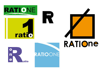
As I was refreshing my skills in illustrator, I decided to make a quick design for a website using my Ratio One logo’s. I have no experience in building or designing a web page so I was eager to see what I could do. I have no idea on the first steps of a website being constructed but I am working on a placement at a design website agency for sometime in the next couple of weeks.
Ratio One Logo
This week, I decided to set myself a small brief and work in Illustrator as while doing my current briefs, I have not used the software. I felt it was important to stay as fresh as possible with all the software’s as I forget small things like short cuts or quicker methods of doing things while designing if I have not touched the software in some time. I made up a name for an imagery company and decided to make a logo for it. I would say these are nothing special but I was happy to do the designs, as my use on Illustrator was slightly refreshed.
Business Card
This week I have been given a brief to make a business card for a small recruitment company. I have decided to make some quick designs with my details timed at five minutes per design. I feel I have come up with some good results and this method helps your speed on software. I would not consider this method all the time when designing but some good results come out of it.
Monday, 28 September 2009
Crowded Place - The Tolerance Festival
As the deadline draws closer, the ideas for the tolerance brief seem to be getting somewhere. Kat and I have again, sat down and discussed where we both want to take this brief. This was one idea we came up with yesterday and today with the numbers representing a crowded area. We want to really give it a strong final push. Our tutors seemed happy with our progression within the designs, ideas and research but feel we have the capabilities of taking it one step further. After a long talk, we have both decided to play with type and colour. Again, watch this space.
Sunday, 27 September 2009
Polaroid Photo Canvas
Around twelve months ago, I had an idea in my head, which involved Polaroid frames. I wanted to create something with a decent amount of images on one big canvas. I had the idea of placing all the images in a Polaroid frame. I decided to get my design on paper so I would pursue it in the future. As Christmas was near, I was figuring what to buy my sister for a gift. I felt this was the perfect time to push this idea as if my idea worked out correctly, I could build on it by producing more.
After getting the design done, I sent the artwork to print as well as making the frame. After the attachment to the frame was finished, I had shown my friends and family. The best thing about this is every time you look at it, you see a photo, which you did not see the previous time. My sister was very happy and proudly hangs in her living room to this day. She has shown it to every guest she has had. I am proud to say that i have gone on to do three more canvas prints and more are being asked for. I learnt that pushing an idea and taking a risk can sometimes work out brilliantly.
Friday, 25 September 2009
Vrsus Beer
As I was doing some research, I found this add on the Internet (and also from the book, Creative Advertising). I love the way the bottles of beer have been used here. It sends the right message out to the consumer about the product. Sex does indeed sell and the use of shape within the bottle is very clever.
Queue Pushing - The Tolerance Brief
Today, Kat and myself reached a good stage in our thinking towards the tolerance brief. We both decided to sit down and talk about our ideas and show our input in them for improvement. We came up with some great things, which we look forward to pushing within the next few days. Here is our idea at this stage. Obviously this will again improve but the idea is getting stronger. Watch this space.
Holiday T-Shirts (Complete)
Fashion Sale
As I walking through Manchester the other day, I came across this sign for a clothes sale. It made me laugh as everyday I study the means and ways of advertising, layout, communication and most importantly, design and I see this little effort to promote a clothes sale. As poorly as it looks, this made me think that in someway, it sends out a message. Maybe not a great message as the little effort put in the sign to tell there customers about the sale interprets a tacky, cheap clothing shop, but the fact whoever was given the job to do this had one thing in there mind, quick, effortless and simple. Sometimes being quick and simple can produce some nice work (obviously not in this case).
Wednesday, 23 September 2009
More Ideas - The Tolerance Festival
Here is another design poster for the tolerance festival. The idea behind this is not show the entire story, but for the poster to show enough for the reader to get an idea. I have made the document look like an in- design file in some way by placing a box with the red symbol at the bottom to show an overlap of text in the box. Again, these are just ideas at this stage but the progress is going well.
Good Typography is Unnoticeable Typography
Tolerance Festival Type Poster
As the tolerance brief is moving on, Kat and myself feel we are getting to a decent stage. We decided to voice record the public on what tests there tolerance and we got some funny and positive results. We are still in the creative process and ideas are always changing but from the research we both gathered, we would like to look towards a typographical poster or gorilla advertising. Here is a series of three posters I have done to show for a small meeting with our tutors in the next few days.
Lonely Planet
As I was researching some advertising campaigns, I came across these posters in the 2007 D and AD Annual for the Lonely Planet. I felt the concept of using images with a description of someone’s experience on an object was clever. Kat and I have decided to look into this a little more and explore the idea.
Friday, 18 September 2009
My Book Collection - Five New Books
I have recently added some books to my collection. I have purchased No Logo by Naomi Klein. This is an in-depth book about branding. I first read parts of this while completing an essay last year but never took the time to finish it. I also bought Its Not How Good You Are, It's How Good You Want To Be and Whatever You Think, Think the Opposite by Paul Arden. I would say these are motivational books but I feel the points are very inspiring towards idea-based projects. Others are ABC 3D by Marion Bataille and Typeface: Classic Typography for Contemporary Design by Tamye Riggs (which I am greatly looking forward to exploring).
Typographic Posters
As the tolerance brief is moving on, Kat and myself began to research some typography posters for some inspiration. We were lucky to come across some nice work and hope to use the methods in our ideas. Here are some nice typographical layouts with a great use of colour. The website we found these posters from was smashingmagazine.com
Wednesday, 16 September 2009
Tolerance
This past week, I have started a new brief and the aim for this is to promote tolerance around the city of Manchester for a unique festival. I have teamed up with my classmate Kat to tackle this brief and working with her is going to be different but also a pleasure. This past week, Kat and I decided to research deep into the meaning of the word tolerance. We have found some interesting things, which have helped us come up with some great ideas. After a few discussions, one idea we had was to use the ''count to ten'' method for stressed out people. We have chosen ten small irritating things what test people’s tolerance and typographically turn them into a meaning for a poster campaign. Here are some designs I did today for the words tap, snore and drip. The process of the brief will move on dramatically from this but the first stages, we are very happy with. More details to follow.
Tuesday, 15 September 2009
Pecha Kucha
As the first day of term arrived, one of the summer briefs was to research and perform a Pecha Kucha (usually pronounced in three symbols ‘’Pe-chak-cha’’) presentation. The details of this method of presentation is to use a power point slideshow and talk through each slide lasting 20 seconds with a total of 20 slides with a time period of 6 minutes and 40 seconds. Our brief was to prepare for half that time and slides. I collected some of my own previous work, some inspiration and also a small insight into what I would like to work with regarding materials and briefs in the future. The presentation went well and feel confidant in using this method again. Here is a 2.5 second per slide version of my presentation.
21st birthday Invites
This week I had a phone call from a friend asking for some 21st birthday invites to be designed ASAP. His description was for them to be busy and to have a party like feel. I decided to look at nightclub flyers for some inspiration. I began using black and yellow as the colors interact so well. From there, I placed small boxes around each piece of text in a toned pink to lift it of the page. I sent the invites out and the client was over the moon. I decided to add a small tone of blue to the piece as it helps the design stand out more. Again, after sending these to the client, he was very happy with them and has decided to send them to the printers.
Subscribe to:
Posts (Atom)