Friday 26 June 2009

Digital Film Archive Fund A5 Flyer


On my fourth day at Reform Creative, a brief was e mailed in asking for a double-sided A5 flyer to be designed quickly. The design had to be put together within four hours so there was enough time for slight adjustments from the clients if needed. Rich was taking on the brief but as I was eager to get an understanding on working towards tight deadlines, I decided to see what I was able to produce within the time. Rich went through the brief with me and pointed out some of the things I should think about when designing the piece.

As the flyer was for the Digital Film Archive Fund, the website pointed out this was for public access to screen heritage innovative exhibition, education and online programming. As I began to design, I was asking for pointers and opinions from both Chris and Rich. They both were happy to guide me through it. As the typography became to the tweaking stage, Paul made some useful pointers within InDesign. As me and Rich was finished, Paul sent to artwork off to the client. The next day, Paul explained the client preferd my design and will go to print within days. This is the first piece of work which has gone commercial and I am delighted.

Contact Poster


The early stages of the Contact brief were a working out process on how I would apply the message, which was on the brief. I started to use the logo and different brush stokes and place the number above, under and the right side of the text. From the beginning stages to the outcome, I am very happy. The journey was an on going learning process and I feel this was definitely worth it.

Reform Creative


This past week, my placement with Manchester based graphic design studio, Reform Creative was an experience I will never forget. As arranged with creative director, Paul Heaton, my hours were from 9 am until 6 pm throughout the week. I was eager to see what it was like to be in an environment with such a talented, highly class graphic design agency. I arrived on Monday morning feeling excited but also slightly nervous. As I walked up the four flights of stairs, I gazed at the lift placed in the centre of the staircase, which reminded me of the Tower of Terror ride in the United States. As I knocked on the studio’s door, Rich Smalley, one of two designers, greeted me.

As I hung my coat up, I was then introduced to Chris Forrester. He was the other designer. Both Rich and Chris made me feel at home straight away. After knowing them for two minutes, I new the next five days were going to be fun. Soon after, Paul arrived to the studio. We both sat down and discussed what the week ahead would involve and what tasks were planned. Paul explained some briefs the studio had with no real deadlines was key for me to work on as I would have an idea of what its like on a real life brief. Also, to a standard of acceptance regarding the quality of work for a major client was important.

One of the briefs set was by theatre group Contact. There ten year anniversary is due and Reform was asked to involve this in there current logo. Paul advised me to do some research on Contact and get a good idea of who they are, what they do and what they aim to do. After a morning of browsing there website, I noticed they focus on young adults aged between 13 and 30. Some of the activities involved theatre, dance, poetry, music and fashion.

I began to mess around with the logo and try new ways of involving the number ten. I tried this with the word and number. The stages of progression were slow but Paul reminded me the process would be a journey like my previous work in my portfolio. In the afternoon, Paul gathered myself, Rich and Chris together for a meeting regarding ongoing briefs and where the agency was with each deadline. I was amazed to see how much work Reform had. Around thirty to forty jobs were live and what impressed me the most was the team had all of them covered and new what direction needed to be taken on each brief. The team was also interested in what I had to say regarding there ideas and on going work. This made me feel part of the team a great deal.

As the day ended, it seemed the nine hours felt like one. The next two days involved me working on the Contact brief, figuring out the right way to send the correct message involving the tenth anniversary in the logo. As my research came along, I noticed some Coca-Cola illustrations, which I was eager to involve in my work. I began to draw some youthful objects like a trainer, a hooded top and a television. My idea was for these objects to look like they were bursting out the logo and making up the shape of the number ten. As more objects were drawn, I began to see a small paten evolve. I successfully drew an iPod, which then gave me the idea of using the outline of the ten as the headphones with the objects placed inside them.

Paul was very eager for me to push this idea forward, which inspired me even more. As the objects were all drawn and grouped, Paul and I felt it was a good idea to use the same typeface as the logo for the word ’’years’’ placed under the ten. As the logo was hand drawn, I needed to take the elements from the letters c, o, n, t, a, c, and t and make the word year in the same typeface. After a number of efforts with the help of Paul, the challenge of drawing a typeface was completed. The next task was to involve some colours to give the piece a lift from the page. After making a number of different colour combinations, I was very happy with the outcome. Paul did explain the chances of the work being used is small due to the image scaled down would not function or look right. Paul did however explain he would be sending the work to Contact for a possible poster campaign.

While working on the Contact brief, I improved my Illustrator skills a great deal. Shortcuts, quicker ways of working solutions out and making the software easier to use was great for me to learn. As I was sat next to Paul in the studio, I was shocked to see the amount of e-mails he received from students and designers with there work. What impressed me the most was Paul always found time to look through each e-mail and work even though he had a busy schedule. One morning, Paul received a letter and some pieces of work from a second year student. All though the e mails sent to Paul looked very good, the way the girl had gone about sending the work made her stand out a great deal. She had sent five to six pieces around A6 size with a letter stating her passion for design and how she has been using Reform as a resource on a weekly basis. She also stated her fascination with the agency and was eager for a two week placement. For myself, this gave me some ideas on how to stand out in the crowd when wanting to be noticed.

As the last day was near, I woke up feeling a little sad after spending the week with the team. All though I was very proud of my work and what I have gained, I felt sad that I would not be able to spend more time with the team on an everyday basis. As the day consisted of me finishing my work, myself, Rich, Chris and Paul all had a nice relaxed afternoon. Paul explained in morning he regards placements as freelancers and I was pleasantly surprised to receive a £50 cheque for my trouble. This made me feel very proud having Reform Creative as placement. Besides me gaining experience and good work to go in my portfolio, I have also gained three great friends and will forever be grateful for there time and effort in helping me understand the industry.


Tuesday 23 June 2009

Coca-Cola Art


As I was recently researching the Internet for a brief I am currently doing on my placement at Reform Creative, I was amazed at the Coca-Cola illustrative posters. The theme is for a paten to look like its bursting out of the bottle. As one captured my eye on flickr.com, I decided to look into the images more. I was pleasantly surprised to see endless pages of examples. The best thing I mostly like about these series of posters is each one has a different look but points towards a musical, surreal way.

Monday 22 June 2009

Busuness Cards to print


This past week, i was asked to produce some business cards for a joiner. After some tweeks and discussion with the client, the decision was to choose the one side color print design. I then began to find a printers who had a good cost value. I have sent this to the printers and hope to find the results later this week.

Thursday 18 June 2009

Busuness Cards


This past week, I was asked by a friend to make him some double sided Business Cards. As he is a joiner, i wanted to make the cards similar to the use of the trade. I have used a ruler in millimetres on one design and an image of a piece of wood on another. I feel the strongest out of all the designs are the top three. I have used Adobe Illustrator's pen tool to draw round a hammer and used a brush stoke for a quick sketch effect. I have added a close up of the hammer on one side and the details on the other. I have made three different outcomes for my friend (the client) to choose from. One black and white, one with a hint of colour and the final one full colour. I will send the final design to print some time next week. I look forward to the process and the results on the finished design.

Holiday T-Shirts (Design Process)


Since my screen-printing t-shirts post, I have had some good feedback from various people. The response had all been positive which I am happy with. A friend who had a look at the t-shirts has asked me to print some basic holiday t-shirts for the airport. I have taken the names, numbers what they wish to use, and made some quick digital mock-ups. My friend seems very happy with the choice of colours and the design. I have kept it very simple as he requested this. I will be screen-printing again this week so fingers crossed, I will get some nice results.

Reform Creative - Placement


As I arrived home from my portfolio visit at Reform creative, I recieved an e-mail from Paul. He said it was a pleasure for him to of met me and thanked me for coming along. He also said I was welcome to spend a week at the studio whenever I felt was the right time. I was over the moon with the news and I have arranged a placement for next week.

Reform Creative


In April, I decided to send an e -mail to local Manchester based Graphic Design studio Reform Creative. I was overwhelmed with there portfolio and there mind frame on the industry inspired me to contact them for some advice and maybe a portfolio visit. As the weeks passed, I was unfortunate to hear from Reform until a couple of days ago, Paul Heaton, the creative director, e mailed me saying I was welcome to come along for a quick chat. As I googled mapped the Reform for the location and route, I was slightly confused as I was getting two different addresses. Reform had recently moved locations as the original studio was unfortunately in a fire around two years ago. After doing some research, I noticed they had now gone back to the original location.

As I arrived, I was welcomed in and asked I wanted some refreshments. As I waited for Paul, I looked around the room to find the work I had seen on the website. I also noticed some awards, which was nice. As Paul sat down next to me, I began to talk through my portfolio as he looked through each piece of work. I began to talk about the process on each piece and what journeys I had made throughout each brief. As we discussed, Paul told me some really useful advice regarding presentation, concept and functionality on each piece. It was definitely rewarding to hear.

As we came to the end of the portfolio, we discussed the industry and what ways to stand out, get the best out of yourself and enjoying your work. Paul related to my journeys in finding an outcome in a brief. He explained one brief he had in the past was to produce some stationary for a joiner. He had come to an agreement where Reform could do what they wanted, and they would not charge a single penny. Paul explained that all though they didn’t make any money from the project, it was an opportunity to enter some functional client work in competitions. He said the journey process was hard but from the starting point to the finishing line, all the hard work was worth it and the learning the team had gained from it was worth more than being paid.

I decided to ask Paul how long Reform would normally spend on competition work as there busy schedule on client work would interfere. He explained in some cases competitions can be as important as client work because when the more awards on show, this gives the client confidence you are well equipped and producing something good for them. Paul did however state the client should always be regarded as the most important asset.

Tuesday 9 June 2009

Hacienda Letterhead


As I was looking through some advertising books, I noticed a spread, which focused on envelopes and how many different varieties you can have. The design edge of the air male envelope instantly reminded me of the Hacienda nightclub. I decided to capture an image of an air male envelope and use it as a resource to create a design for the Hacienda. I feel the idea was successful.

Toxel.com - Brock Davis


Again, while researching Toxel.com, I noticed some nice creative work by an American artist called Brock Davis. His form of art shows how things what do not normally shatter would look if they did. The method is very simple but the idea is definitely creative. I hope to follow more of Brock Davis’s work in the future.

Toxel.com - Computer Mouse Designs


Again, looking at Toxel.com, I came across some clever ideas in designing a mouse for your computer. The idea of the Mouse being something more than an ordinary piece of equipment made me think that in design, anything is possible. The way the object has been changed but has the same, ordinary feature is brilliant.

Toxel.com - Bus Stops


As previous posts shows, I like to research design and how clever ideas can turn into something comical but work at the same time. My trusted resource, Toxel.com posts new ideas from all around the world each day. I had recently visited the site to find some useful ways of turning a bus stop into something inventive and creative. I like the thinking and structure behind these bus stops. They work really well.

Monday 8 June 2009

Adobe Illustrator - Pen Tool


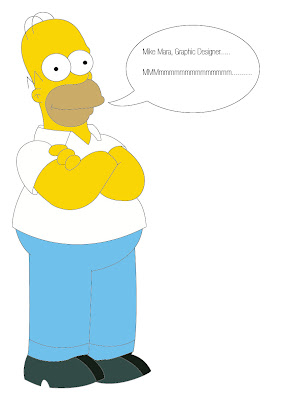
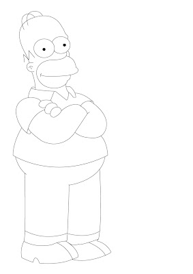
Over the past year, I have been eager to improve my Adobe Illustrator skills. The main area I want to be fluent on is the pen tool. I decided to take on a few familiar cartoon characters and see if I can get them to a vector, then add the right colour to the empty sections. Here I have traced Homer Simpson. I feel happy with the outcome but I wish to now look at the shadow area’s what complete the image. They say practice makes perfect so I will be exploring my skills more and more.

Stephen Logo's - New York City


This past week, I had a reply from another studio in New York. I managed to get in contact with a company called Stephen Logo’s. They had some nice work and I was pleasantly surprised with there reply. As my e-mail contained questions regarding a structure of a portfolio, how to stand out in the industry and dealing with clients on a one to one basis, Stephen Logo’s gave me some useful advice. They advised placements are vital in getting a good start in the industry, as getting real world experience is vital. Regarding a structure of a portfolio, having work you are uncomfortable with is a definite no. Being comfortable with your work and having confidence is important when talking to someone about it as you will feel less motivated with a poor piece of work. ‘’Show your best work, don’t include something you feel is only average‘’. I feel the advice is definitely useful and I hope to take it on bored in the near future.

Wednesday 3 June 2009

Screen Printing - My Results


Here are my t-shirts from the screen printing process. My favourite one is the grey on grey shirt. I have made a shirt with white paint (as you see, I am not a model) but I feel the silver effect works better. I feel all the shirts are typographically good and I feel I have made a pretty good first time effort.

Screen Printing


This past week, I had made a couple of typography designs of sayings, which I recorded from friends and family members that made me laugh. As I was eager to explore screen-printing, I was able to spend all day this past week in the print room at university. My overall thoughts throughout the process were enjoyable, I felt the length of time, cleaning the silkscreen repeatedly, and mixing the paint was definitely rewarding. I decided to make one or two try out versions for myself to get a good idea on the screen printing method.

Choosing the right colours was vital, as my t-shirts were black, grey and a pale blue. From my try out versions, I noticed white ink was not strong against the black t-shirt. I was advised to use silver foil. To do this, I screen printed a special type of glue on the t-shirt and placed a foil piece of paper which then ran through on the heat press machine. My results were great and I enjoyed screen-printing very much. I will definitely use this method for a design purpose in the near future.

Monday 1 June 2009

Florio Design - New York City


This past week, I had e mailed some graphic agencies from over seas. As our class have a planned trip to New York City this coming winter, I felt showing some of work via the blog address to some company’s over there may give me an idea of what to expect while my trip gets closer. I began to Google some studios local to the New York City centre. I was lucky to come across around five or six agencies. I decided to research each one and pick out a particular piece of work I liked and show an interest by pointing out the strong parts of the work. After my introduction, I asked some questions regarding portfolio structure, dealing with clients on a one to one basis and also how to stand out in the crowed. I was lucky to get a positive response from Florio Design and a portfolio visit for when I am over there.